Boo.
CONTEST WINNER!
RETRORATING: 18
RETRORATING: 12
- HOME
- YOUTUBE
- ARTICLES
- VIDEOS
- THEATER
- CLASSIFIEDS
- VHS COVERS
- CEREAL BOXES
- GAME BOX ART
- READ ALONGS
- PODCASTS
- FORUM
- FAQ
- POINTS STORE
Don't mess
with the bull.
JOIN!!!

Rad Retro Ads
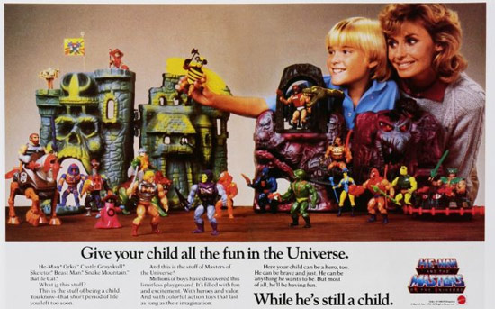
We can't help it, advertising has a huge influence on our growing up. Especially as vulnerable kids. Companies would spend millions bombarding us with promises of excitement, tempting us with delicious morsels and all around conditioning us to beg our parents for their crap. How many of you were watching GI Joes contently without a care in the world until you saw a commercial for the Nerf Bow XP900 and couldn't figure out how on earth you coped with living for the last 7 years without it? In this article I pillaged the interwebs and selected magazine print ads that really capture consumerism in the good 'ol days. Together we'll go through them and discuss the ads themselves. I'll also be adding my biting commentary to dissect and diagnose the underlying social issues that plagued yesteryear...sheesh calm down, I was only kidding. So enough yappin'... lettuce begin...
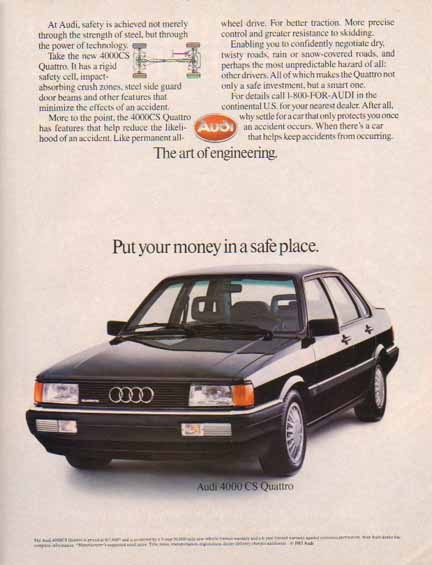
My brother had an Audi with a sub woofer that took up the whole trunk, he was on a first name basis with the police.
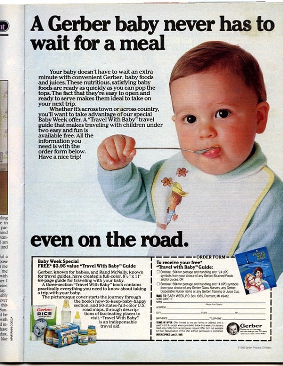
Gerber, saving the general population from public breastfeeding since 1944.

I'm REALLY curious as to what book the girl on the left is reading.
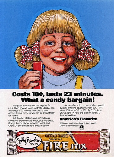
This is what happens when accounting gets a shot at marketing.
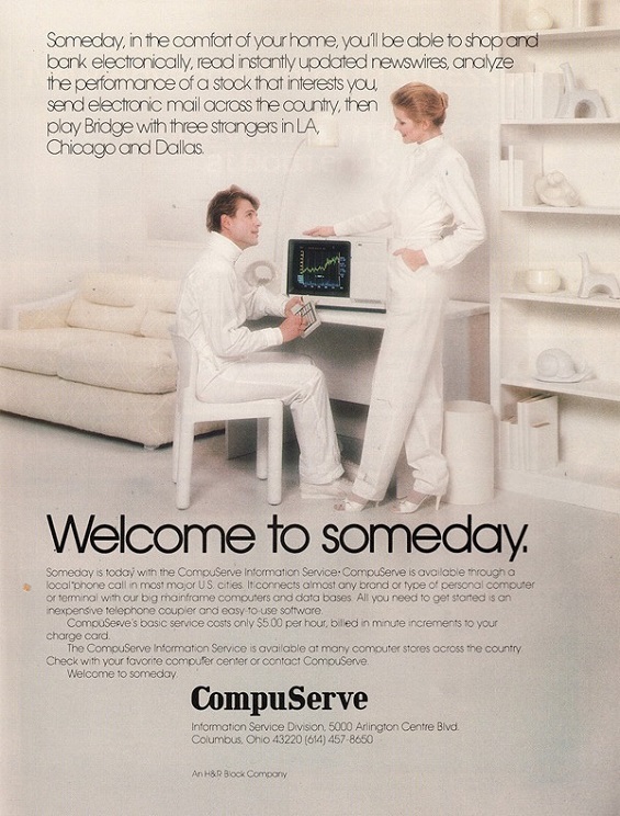
5.00 per hour? That's like 35 dollars to stream Gone with the Wind, RIPOFF!
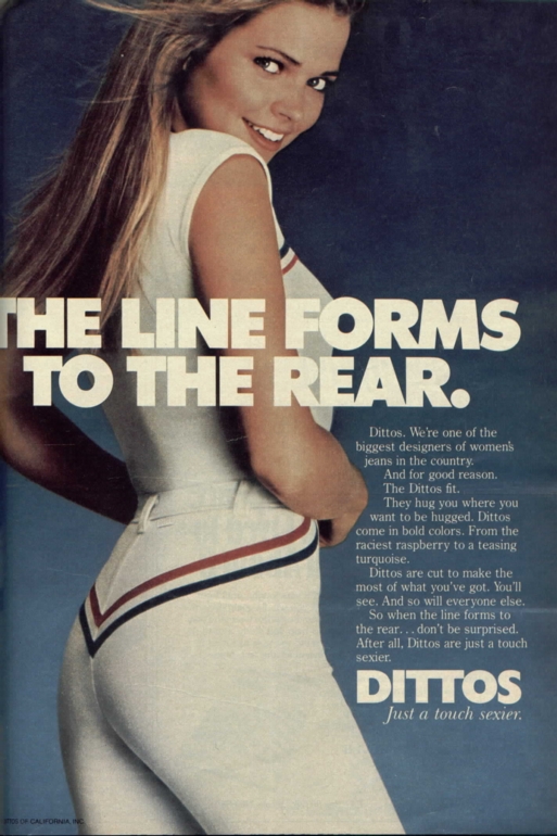
Cute huh? That's actually my mom back in 86 turning to lewd modeling to pay for my braces. Perv.
They say that sex sells. That may hold true to an extent but I feel that even with clever marketing, women wouldn't feel brazen enough to sport pants with arrows emanating from their glutes. This ad is for jeans and looks to appeal to men as a ploy to buy the product for their wives or girlfriends in hopes of getting the same result as in the picture. Good luck!
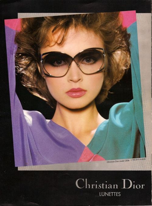
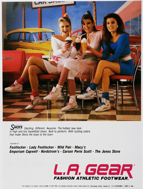
My mom made me wear the light up models to prevent me getting ran over. Til I was 15.
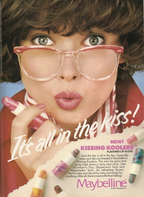
My cousin Sherry gained 12lbs after she started using these.
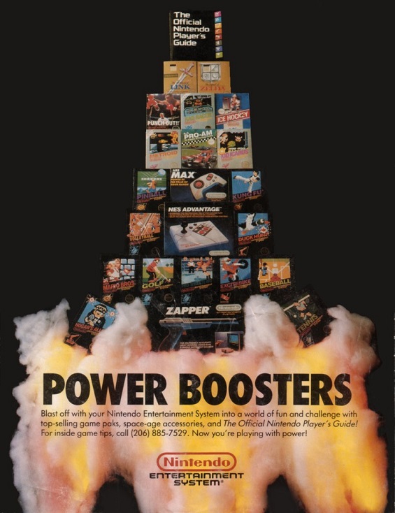
The pyramid of awesomeness or Triangle of isolation, works either way.
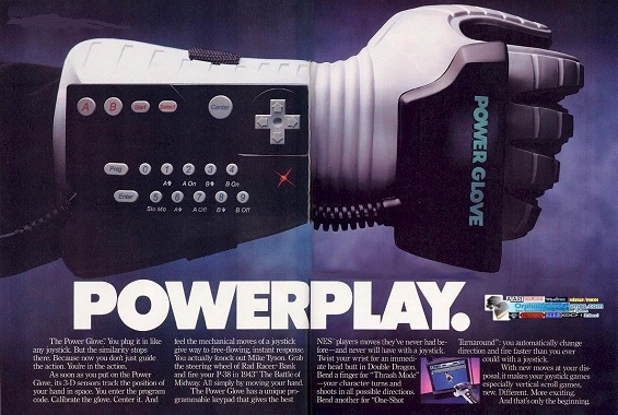
Now this ad has a lot going on. It really makes you want to get close and dissect everything being featured. Tons of exciting looking game titles and out of this world accessories really bring out the material blood lust. No kid wanted to be the only one not playing the latest Mario game or missing out on Zapper gun enabled titles. Atari? That's so 1983, get with it!

Salmon Pink is the adopted son of the 80s.
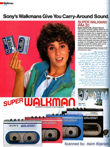
In my day I had to walk 8 miles to school, and scan for 20 seconds to get to the next song.
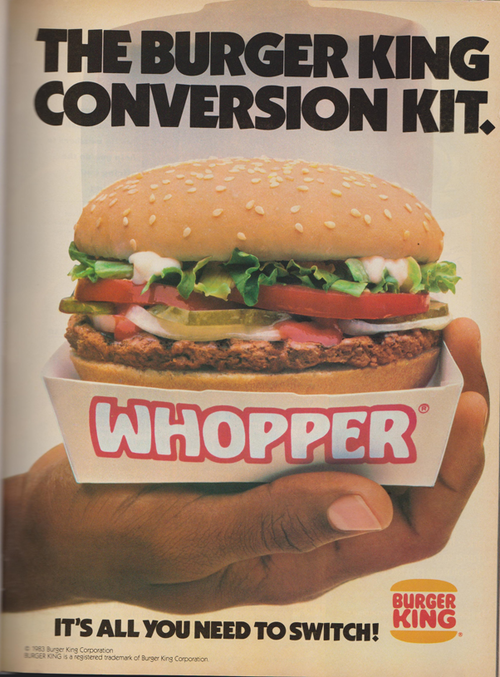
I'll have it my way and go to 5 Guys Burgers and Fries.
I'd like to thank you for reading and leave the comment section open to some of your favorite ads growing up. Also, I included a video of a HBO special called, Buy Me That TOO! It's a great special geared towards kids talking about the deceptive ploys companies use to lure you into wanting their stuff. It's a great special and retro in its own right.

retroboy Posted on Oct 08, 2018 at 08:53 PM
hey do they have anymore ads
IRISHJENN Posted on Oct 07, 2015 at 09:28 PM
OK
kronohs Posted on Aug 21, 2015 at 07:09 PM
I love retro ads.
shakin steak Posted on Jun 19, 2014 at 09:53 PM
How did I miss this article before. I love it. Thanks vkimo.
MissM Posted on Feb 18, 2014 at 07:47 AM
I loved Buy Me That Too! I had tried for the life of me to remember what that show was called a few weeks ago. I thought it was just mind blowing. Nice choice of ads too! Really fun.
echidna64 Posted on Feb 10, 2014 at 09:12 PM
There needs to be a 10X modifier to all retro ratings. You amaze me vkimo, all of your articles, even the older ones are all of superb quality!
vkimo Posted on Feb 08, 2014 at 12:44 PM
They should have used the LEGO approach with flags which was a piece of stiff cloth with a hole at either end of the top on bottom. Simply slide the mast down the holes and done! Placing stickers or decals on toys is an article unto itself!
Vaporman87 Posted on Feb 08, 2014 at 05:32 AM
You know it!!! And while we're talking about it, another thing that caught my eye was the Castle Greyskull flag. That flag was constructed by simply wrapping the sticker around the pole, and the two sides would adhere to each other. You only got ONE shot to get it right, or your flag would be messed up forever. I didn't get it right.
vkimo Posted on Feb 08, 2014 at 02:30 AM
Haha excellent call. Only a certified retrodazer would have caught that one.
Vaporman87 Posted on Feb 08, 2014 at 01:22 AM
I noticed in that ad, that Zodac is hanging out in Snake Mountain with the baddies. They apparently were dividing them up based on the titles given them by Mattel, and not by the roles they played on the cartoon.
vkimo Posted on Feb 08, 2014 at 12:38 AM
I forgot to mention it, but the MOTU ad at the top was pretty shameless in exploiting a mother's love for her child. "While he's still a child"?!
pikachulover Posted on Feb 07, 2014 at 07:39 PM
I remember Kissing Koolers. They weren't that great for a lip product. I remember I saw some for sale in a catalogue and begged my mom to buy me one.
Vaporman87 Posted on Feb 07, 2014 at 07:30 PM
Exactly! That was the epitome of those types of ads! :D I forgot about that one.
vkimo Posted on Feb 07, 2014 at 06:39 PM
And who can forget Fabio gracing the cover of Iron Sword.
Vaporman87 Posted on Feb 07, 2014 at 04:24 PM
Sweet! I love all these old ads. It's strange how obvious it is to us, when we see some of these, what time period these are from.
EVERYTHING... from the colors and content, to the clipart and design, are almost painfully 80s. And I love it. It surprises me that marketing companies have not caught up with manufacturers, the film industry, and the gaming industry, in bringing back what worked in the 80s and 90s. One would think that having the attention of our demographic through our desire to feel nostalgia would be a great thing for marketing. Maybe that's why I'm not a marketer though. :D
I always liked the gaming ads of the 80s and early 90s. They tended to try and add some form of realism to the game via the casting and photographing of somebody wearing similar clothes to the main character of the game doing some exaggerated pose.
For example: http://www.digital-polyphony.com/TMNTArcadegame.jpg
For every year, the Olympic games brought good entertainment to homes of many when either watching from the actual stadium, or the simplicity by the c...
Saturday morning TV was a big part of my childhood. Whether it was watching Pokemon and Jackie Chan Adventures on Kids WB, Recess and Disney's Doug on...
As we moved past the 1990s, the Sony PlayStation and Nintendo 64 were just barely hanging on as upcoming consoles were on the horizon. The Y2K bug end...
Sequels in media will always give a hint of expectation before going into them. Will they be better than what came before it? Do they not update it en...
It's that time of year again as the holiday season has returned. The smells and sounds are in full swing, as well as the specials ...


