Yet both look like they will kill you with a smile.
RetroDaze
Boo.

OFFICIAL

OFFICIAL


Forum » Chew The Fat » McDonald's
|
|

|
|

|
@shakin: Difference #6 was the different colored shoestrings on the right foot. Also, I too hate whoever made this image.
You love this signature.
|
|
There have been so many jokes about the new mascot.
|
|
@TDitH: It's no wonder. It's such a lazy and lame concept, something that's already been covered in conversation at RJ. Basically it's the most generic type of mascot a business could adopt, from a company that already has a stable of recognizable and branded mascots that could have been used.
You love this signature.
|
|
It looks creepy too.
|

|
I think the last difference between the Happy Meal boxes is the leg position between the 2 boxes.
|
|
The difference is that both aren't on fire after being splashed with holy water.
|

|
Looking at the recent Happy Meal commercials, the smiling box seems more silly than scary. Reminds me of one of those Minions from the Despicable Me movies.
My drawing of Jago (Killer Instinct character) as a Funko Pop.
https://i.postimg.cc/QtnKkn4h/34ac2128dd3e522e1b4304ccae1dab36da36cd0807025c34337dd7db929e7eff.jpg  |
|
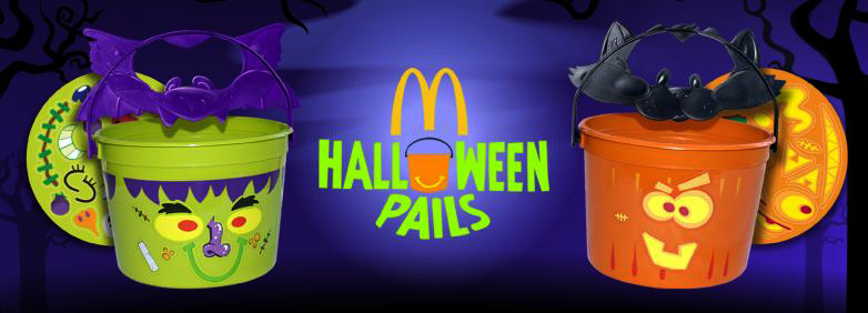
I'd like to see these make a comeback this year... MINUS any commercializing of some toy line.
 You love this signature.
|
|
They might bring the Scooby Doo pails back with new designs. He's everywhere, ya know.
My drawing of Jago (Killer Instinct character) as a Funko Pop.
https://i.postimg.cc/QtnKkn4h/34ac2128dd3e522e1b4304ccae1dab36da36cd0807025c34337dd7db929e7eff.jpg |